
Meliora
Meliora is a new health food store in Brașov, Transylvania, reuniting a variety of organic, local, and seasonal food for people seeking a healthy and conscious lifestyle.
With a beautiful name and a strong concept, they needed a visual identity. I analyzed the brand strategy that Simona and Petru have developed themselves and guided them in finessing it further.
Meliora sets out to help people live healthier lives, in balance with the environment by connecting them to fresh, wholesome food and self-care products. The brand has reliability at its core, with innocent archetypal traits and an optimistic, caring and knowledgeable personality.
Services provided
Brand Identity Design
Brand Touchpoints

Taking inspiration from the meaning behind the name Meliora ("better", “always better” or more fully “for the pursuit of the better”), the concept for the visual identity is built upon the idea of growth.
The symbol consists of three organic shapes, each being a progression in form and scale to the previous one. The figures are inspired by nature and they can be interpreted as a seed, a fruit or a vegetable.
The logotype is displayed using Sharik Sans, an elegant sans serif typeface, conveying warmth and openness, with small interventions to the terminals, making them softer and in line with the symbol.
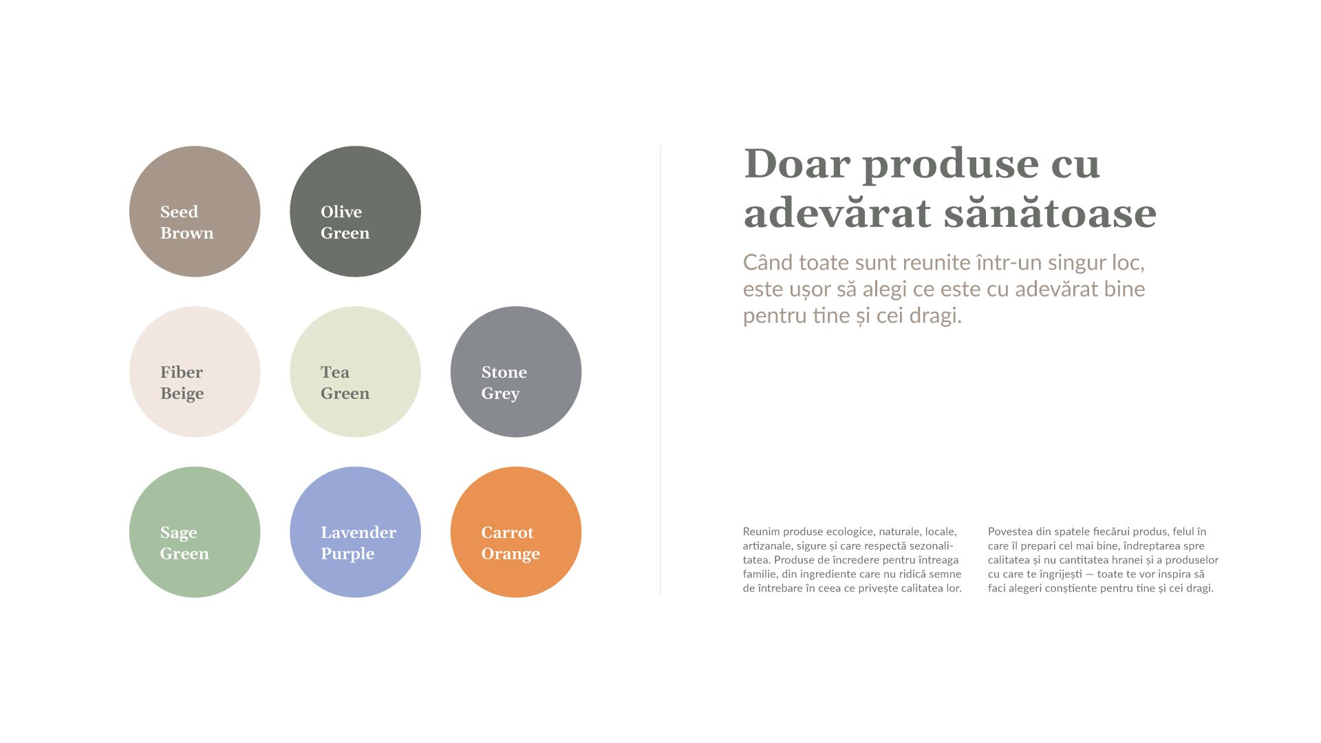
For the color scheme we wanted to avoid the typical green used in this sector of the market, and instead created a palette composed of warm, earthy colors, which we then expanded with vivid accent colors to add a little more energy and variation.
The typography relies on two complimentary typefaces — a serif typeface, to add an air of expertise and trust (used for headlines and for enhancing key messaging) and a warm and elegant sans serif typeface (used for body copy).
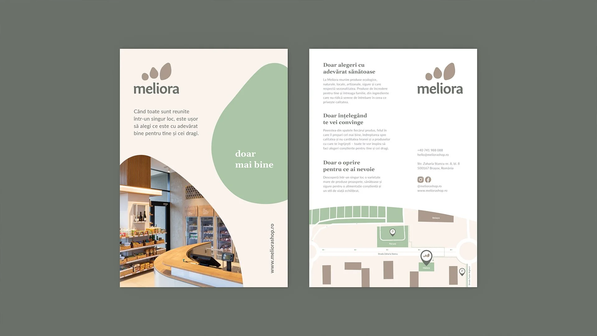
To add more play to the identity, the Meliora symbol morphs into a canvas which can be reinterpreted in endless ways. Each element of the symbol adopts a specific role: background for text, product display — replacing the original shape with a product, and an image container — showcasing ideas, recipes and emotions which create a story around the product. The text is always off-centered and closer to the edges, resulting in a clear space which sustains the idea of potential, a space to grow.
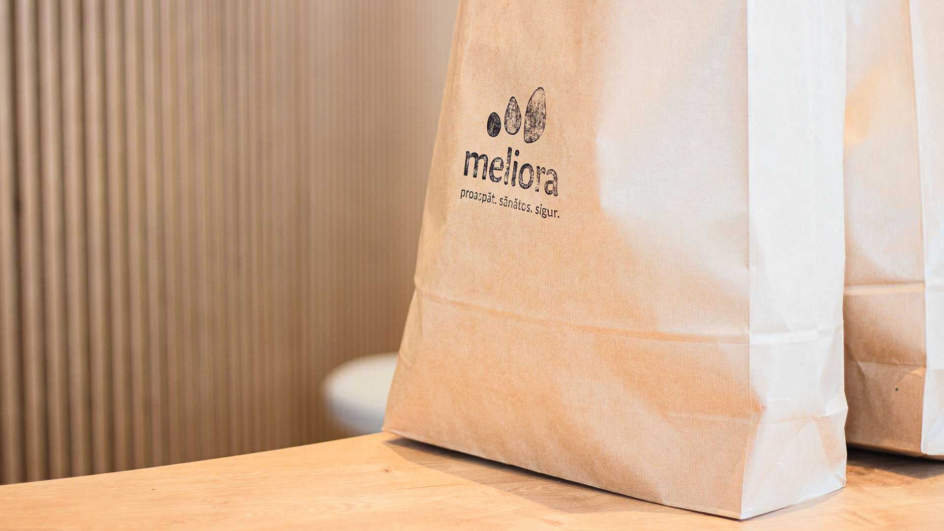
The applications are brought to life through natural materials, truly encompassing an eco-friendly brand — recycled paper for the business cards, paper and canvas for the shopping bags and the aprons.


“The feeling of involvement and the desire to understand every detail were always present. We communicated extraordinarily and felt a great openness on their part to our feedback. Maya and Dragoș managed to embody the Meliora we dreamed of.”
— Simona Călinescu, co-founder of Meliora
Client: Meliora
Design: Maya Ciubotaru,
Dragoș Matkovski.
Team